Classification problems: a look in depth at the k-NN Classifier
Understanding the Scikit-learn kNN classifier beyond simple usage.
Mon Mar 25 2024 19:50:47 GMT+0000 (Coordinated Universal Time)Classification problems
“How things may be in themselves, without regard to the representations through which they affect us, is utterly beyond the sphere of our cognition.”
― Immanuel Kant, Critique of Pure Reason
We often deal with data that can be grouped into different sub-populations, groups that share a set of similar features, a pattern which can be recognised. We call observation a set of measures of the features that allow us to distinguish said sub-groups.
Classification is the problem of identifying to which sub-population belongs an observation. Humans do it on a daily basis and entire disciplines have built their understanding upon classifications. For example, a classification happens when a botanist identifies the species of a flower, or when we have to tell spaghetti from fusilli. We evaluate their category based on some common features that characterise it, and how similar they are, by measuring their features. Immanuel Kant even held that we can discover the essential categories that govern human understanding, which are the basis for any possible cognition of phenomena (I. Kant). In statistics, the concept of feature is related to that of a explanatory variable, and a similarity measure is quantified by a real-valued function indicating the similarity between two objects (classification rule, or classifier).
Naturally, classification problems have a central role in machine learning. We translate the elaborate classification rules to teach machines how to group together data, and hence classify it.
We have two main types of Machine Learning Classification problems:
- Classification: the process where machines group data together based on predetermined characteristics - supervised learning.
- Clustering: the machine finds shared characteristics and then group data when there is no specified category - unsupervised learning.
The choice of effective features is crucial in Classification problems, so that we can define a clear classification rule.
Nearest Neighbours rules
A set of N features creates a feature space of N dimensions, which can be mapped to a real-valued cartesian plane.
In such feature space, observations that are similar will cluster together. The groups formed by the Nearest Neighbours, ideally, have enough contrast to be distinguished in different categories.
{% include figure.html path="assets/img/knn_classifier_1.png" class="img-fluid rounded z-depth-1" zoomable=true %}
For example, in the above image, without knowing anything about too specific about the features, we can clearly distinguish two separate groups (clusters) of observations.
The Nearest Neighbours search is a classification rule that makes a prediction on a new data point finding its nearest neighbour, interpreting cartesian distance as a measure of similarity. How we measure such distance and the rule we use to determine the neighbours make up for different algorithms.
In its simplest implementation, introducing a new point of data the NNS will find the neighbour at the shortest Euclidean distance from it (the most similar in a feature space) and will assign its same class to the new point.
This algorithm can be extended to an arbitrary number of neighbours, k, from which, the k-Nearest Neighbours classification rule.
k-NN Classifier
The kth-nearest neighbor is one of the simplest and most intuitive nonparametric classifiers. When considering more than one neighbour, we use voting to assign a class: we count how many neighbours belong to each class and we assign it to the same class as the one with the highest occurrence.
It assigns z to population X if at least 1/2k of the k values in the pooled training-data set nearest to z are from X, and to population Y otherwise.
kNN algorithms are agnostic of the drivers behind the classification.
Implementation
Implementing the equivalent of the KNNClassifier class from the sklearn.neighbors (Understanding by Implementing: k-Nearest Neighbors) can be an extremely useful exercise.
The sklearn.neighbors.KNNClassifier class has the following main features:
- Can be initialized with a
neighboursparameter (with default value equals to 3). - Has a
fitmethod to train the algorithm with the train data. - Has a
predict_probamethod which takes as input a list of coordinates (lists or tuple) and returns the probability of belonging to each class. - Has a
predictmethod to get the predicted class values for the input array.
class KNNClassifier():
    def __init__(self, k=3):
        self.k = k

    def fit(self, X, y):
        #add some validation
        self.X = np.copy(X)
        self.y = np.copy(y)
        self.n_classes = self.y.max() + 1
        return self

    def predict_proba(self, X):
        '''
            This method calculates distances and selects the smallest k,
            returning an array of probabilities of belonging to each class.
        '''
        res = []

        for x in X:
            #calculate Euclidean distance
            distances = ((self.X - x)**2).sum(axis=1)
            k_smallest_distances = distances.argsort()[:self.k]
            closest_classes = self.y[k_smallest_distances]
            occurrences_per_class = np.bincount(closest_classes, minlength = self.n_classes)

            res.append(occurrences_per_class / occurrences_per_class.sum())

        return np.array(res)

    def predict(self, X):
        '''
            This method returns the class with the highest probability associated.
        '''
        probabilities = self.predict_proba(X)
        return probabilities.argmax(axis = 1)
Testing the KNN Classifier
With the help of the sklearn.datasets module, let's first generate 200 random observations of a set of 2 features for 2 classes.
X, y = datasets.make_classification(
    n_features=2,
    n_redundant=0,
    n_informative=2,
    n_clusters_per_class=1,
    n_classes=2,
    random_state=1234
)

print(f'Number of observations: {X.size}\nNumber of features: {X[0].size}\nNumber of classes: {y.max() + 1}')
Number of observations: 200
Number of features: 2
Number of classes: 2
and let's visualize its 2-dimensional feature space.
df = pd.DataFrame(X, columns=['Feature 1', 'Feature 2'])
df['Class'] = y

sns.set_theme(style="white")
fig_1 = sns.scatterplot(data=df, x='Feature 1', y='Feature 2', hue='Class', style='Class', palette='Set2')
fig_1.set(xticklabels=[], yticklabels=[])
;
{% include figure.html path="assets/img/knn_classifier_sample_data.png" class="img-fluid rounded z-depth-1" zoomable=true %} We need to split our dataset into a train dataset and a test dataset, with a 80:20 ratio.
To ensure we're not going to incur into an issue of Overfitting, where the algorithm has been trained with a non-homogeneous dataset, we need to randomly re-arrange our ordered data.
To do so, we create an array of a random re-arrangement of indexes, one of the possible permutations.
from numpy.random import default_rng
rnd = default_rng(seed = 12)

permutation = rnd.permutation(len(y))

X = X[permutation]
y = y[permutation]
We can then define and apply our train_test_split function to performs a split of the data.
def train_test_split(X, y, ratio_x = 0.2):
    n_test = int(ratio_x* X.shape[0])
    n_train = X.shape[0] - n_test
    return np.copy(X[0:n_train]), np.copy(y[0:n_train]), np.copy(X[n_train:]), np.copy(y[n_train:])

X_train, y_train, X_test, y_test = train_test_split(X, y)
Finally, we train and test our MVP KNNClassifier class.
my_knn = KNNClassifier(k=4)
# training
my_knn.fit(X_train, y_train)
# generates probabilities of three random points from the test set
my_knn.predict_proba(X_test)
array([[0.  , 1.  ],
       [0.  , 1.  ],
       [0.  , 1.  ],
       [0.  , 1.  ],
       [0.  , 1.  ],
       [1.  , 0.  ],
       [0.75, 0.25],
       [0.  , 1.  ],
       [0.  , 1.  ],
       [0.  , 1.  ],
       [0.  , 1.  ],
       [0.  , 1.  ],
       [1.  , 0.  ],
       [1.  , 0.  ],
       [0.25, 0.75],
       [1.  , 0.  ],
       [1.  , 0.  ],
       [1.  , 0.  ],
       [0.  , 1.  ],
       [0.  , 1.  ]])
The above result is a Confidence score, which tells us, for example, that the first element has 100% probability of belonging to class 2.
Analysis of the KNN Classifier
We can see how our model is doing by visualizing its Confidence score. We will use shapes to denote the Classes, and the color will indicate the confidence of the model for assign that score. I'll follow the analysis suggested in the Plotly documentation for the KNN classifier (KNN Classifier - Plotly).
y_score = my_knn.predict_proba(X_test)

fig = px.scatter(
    X_test,
    x = 0,
    y = 1,
    color=y_score[:,1],
    range_color=(0,1),
    color_continuous_scale='tropic',
    symbol=y_test,
    labels={'symbol': 'Class', 'color': 'score of <br>first class'}
)

fig.update_traces(marker_size=12, marker_line_width=1.5)
fig.update_layout(legend_orientation='h')
fig.show()
{% include figure.html path="assets/img/knn_classifier_plotly_score.png" class="img-fluid rounded z-depth-1" zoomable=true %}
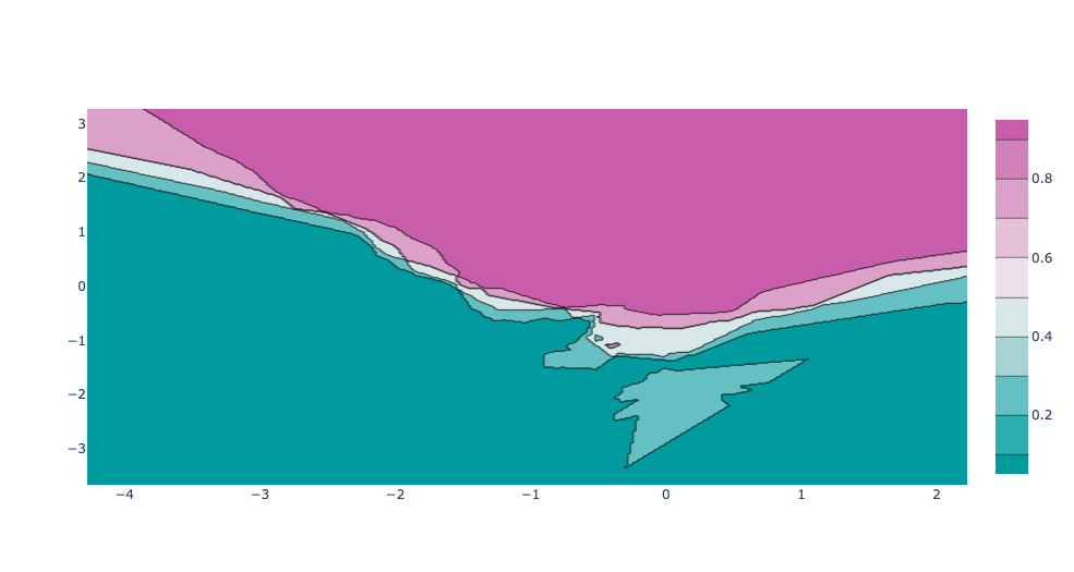
For two-dimensional feature spaces, we can also illustrate the prediction for all points in the feature space. This is achieved by coloring the plane with the class-color that the KNN would assign to in that point.
This lets us view the decision boundary, the divide between where one or the other class are assigned.
We'll achieve this by creating a grid with np.meshgrid, where the distance between each point is given by the mesh_size variable, and evaluate the confidence score of the grid points. Then, we plot it with a contour plot.
def build_range(X, mesh_size=.02, margin=.25):
    '''
    Create an x range and a y range for building a mesh grid in the feature space
    '''
    x_min = X[:, 0].min() - margin
    x_max = X[:, 0].max() + margin
    y_min = X[:, 1].min() - margin
    y_max = X[:, 1].max() + margin

    xrange = np.arange(x_min, x_max, mesh_size)
    yrange = np.arange(y_min, y_max, mesh_size)
    return xrange, yrange

def train_model_on_grid(X, y, k, xrange, yrange):
    '''
    Creates a mesh grid and trains the model on the grid points
    '''
    xx, yy = np.meshgrid(xrange, yrange)
    test_input = np.c_[xx.ravel(), yy.ravel()]

    myknn = KNNClassifier(k)
    myknn.fit(X, y)
    Z = myknn.predict_proba(test_input)[:, 1]
    Z = Z.reshape(xx.shape)

    return Z

xrange, yrange = build_range(X)
confidence_score = train_model_on_grid(X, y, 4, xrange, yrange)

fig = go.Figure(data=[
    go.Contour(
        x=xrange,
        y=yrange,
        z=confidence_score,
        colorscale='tropic'
    )
])

fig.show()
{% include figure.html path="assets/img/knn_classifier_plotly_contour_no_data.png" class="img-fluid rounded z-depth-1" zoomable=true %}
We can also combine our contour plot with the first scatter plot of our data points. This way, we can visually compare the confidence of our model with the true labels.
trace_specs = [
    [X_train, y_train, 0, 'Train', 'square'],
    [X_train, y_train, 1, 'Train', 'circle'],
    [X_test, y_test, 0, 'Test', 'square-dot'],
    [X_test, y_test, 1, 'Test', 'circle-dot']
]

fig = go.Figure(data=[
    go.Scatter(
        x=X[y==label, 0], y=X[y==label, 1],
        name=f'{split} Split, Class {label}',
        mode='markers', marker_symbol=marker
    )
    for X, y, label, split, marker in trace_specs
])

fig.update_traces(
    marker_size=12,
    marker_line_width=1.5,
    marker_color="#FFFFFF"
)

fig.add_trace(
    go.Contour(
        x=xrange,
        y=yrange,
        z=confidence_score,
        colorscale='Tropic',
        opacity=0.5,
        name='Score',
        hoverinfo='skip',
        showscale=False
    )
)
fig.show()